Simplified shop finances

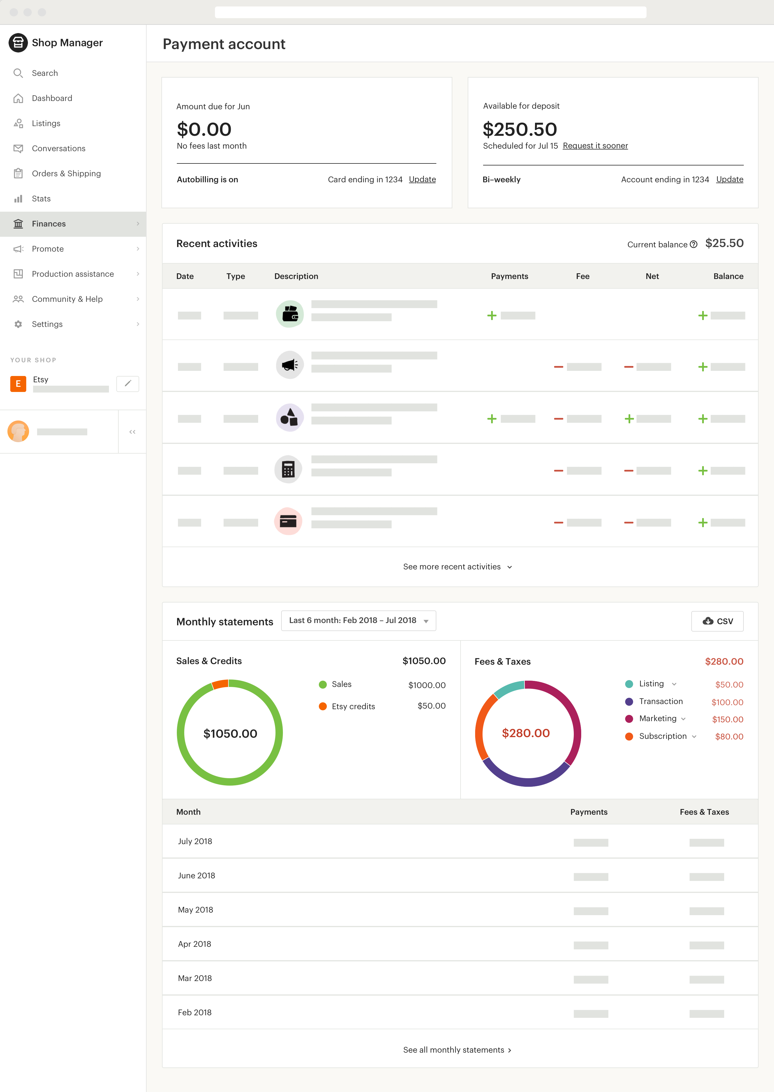
Created a simpler financing experience for Etsy sellers that automatically deducts fees from sales amount, while making information clear and transparent to help sellers manage their shop finance.

Company

Etsy, Payments team

Year

2018

Role

Lead product designer, UX,UI,Frontend

The team of two Product Managers, 1 Engineering Manager, 6 Engineers.

Challenge

Old finance experience for Etsy sellers was complicated, fragmented, and information was clustered. Income and payments were managed in 2 separate pages, and sellers had to go several layers deep to find the specific information they wanted. If sellers forgot to pay fees on time, their shops were suspended without a clear explanation. Visually, this part of experiences was busy, clustered, and using depreciated interfaces didn’t match up to Etsy’s new branding.

Approach

There has been requests from sellers to combine bills and payments pages in the past. However, we were also conscious of the fact that sellers tend to be adverse to dramatic workflow changes, especially when it’s related to finaces. To ease this changes, we validated several hypothesis through user research and data anlaysis, and went through extensive stakeholder and information architecture reviews. We were able to move forward with confident that this change will be good for both sellers and for Etsy in the long-term.

Outcome

The overall UI feedback from sellers was that this information is much clearer, transparent, and simpler than in the current bill. International sellers were especially pleased that now they can see their finances in their local currency. Eased out adverse reaection by slow ramp up and long beta testing period. Also, Etsy was able to reduce processing fees and loss from bad depts significantly.

Design process

To untangle this complicated and information heavy problem, I started by imagining north star experience and created a user goal separate from business goals based on it. Also, created definition on every components to have shared understanding across teams. Having design principle helped guide design decisions throught the process. Used data driven approach to understand what features are used often, and not. Data analysis and User research.
Design principle
  • Don’t show if information is not relevant seller’s current ituation.
  • Group items to make simple. For exmaple, group all the relevent items related to listings fee.
  • Have Clear action item for each state. If there is no action to take, make it clear.
Tools used

Sketch, HTML/CSS

My takeaways

  • Keeping a design documentation on terminology, open questions, data, and research helped team members to have shared understanding on the intense information heavy project.
  • Prototyping scenarios through out time changes was great way to see if design works overtime for various scenarios.
  • Having 2 Project Managers was great
  • Dealing with money is very challenging legally, technically, and emotionally.